Tutorial 4: Creating a radar plot for individual characters using custom word lists in a Dutch fairytale corpus
This tutorial is part of a series demonstrating the use of StoryNavigator widgets. These tutorials show how to use StoryNavigator widgets with other pre-existing widgets available within the Orange platform, and how to generate output via tables or figures. Each tutorial addresses a research question related to the narrative structure and contents of the corpus of stories.
Step 0: Research question
This tutorial will guide you through the process of using Orange and StoryNavigator widgets to create a radar plot for individual characters in a story, based on predefined word categories (e.g., Halliday’s dimensions). The approach is adapted from the workflow presented in Andrade & Andersen (2020).
we focus on the question:
How do different categories of verbs, as categorized by Halliday’s functional dimensions, distribute for a particular narrator or person in a story?
We use the following workflow:
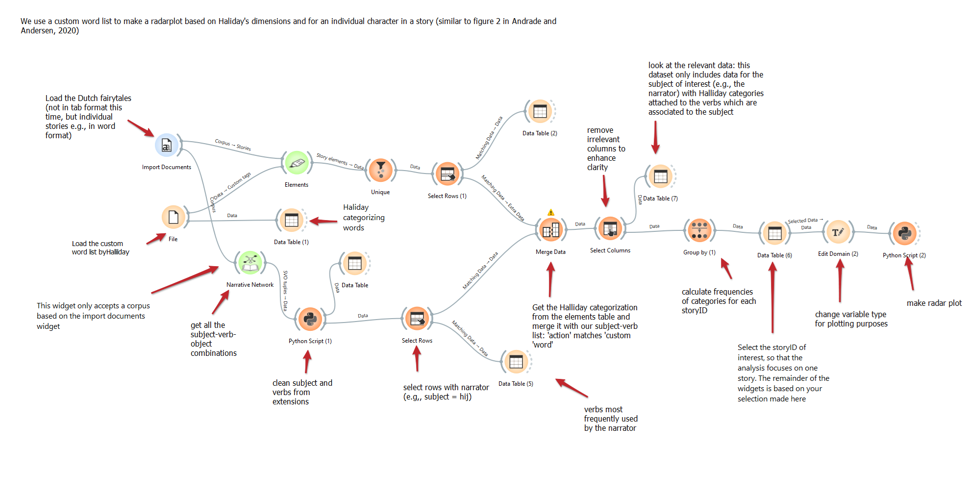
This workflow can be downloaded here, and it uses a dataset of Dutch fairytales which can be found here.
Step 1: Load the Corpus
Task: Import the corpus of Dutch fairytales in tabular format using the Import Documents widget.
Outcome: You will be able to inspect the stories for visual validation.
Widget: Import Documents
Hint: Ensure the stories are properly loaded, with each document represented in the corpus.
Step 2: Load the Custom Word List
Task: Load the predefined custom word list inspired by Halliday’s functional categories using the File widget. The file
dutch_halliday_action_list.csvcan be found here.Outcome: The word list will be loaded and prepared for merging with the fairytales dataset.
Widget: File → Data Table (1)
Step 3: Extract Subject-Verb Combinations
Task: Use the Narrative Network widget to extract subject-verb combinations from the Dutch fairytales. This will enable us to focus on the verbs used by specific narrators (e.g., “ik”).
Outcome: Subject-verb combinations will be prepared for further analysis.
Widget: Narrative Network → Python Script (1)
Hint: Clean the subject-verb combinations using a Python script, removing any unnecessary extensions related to _subj or _obj using the python script widget. Insert the following script in the corresponding editor:
from Orange.data import Table

# Assuming 'in_data' is your Orange Table object

# Extract the column indices for 'subject' and 'object'
subject_idx = in_data.domain.index('subject')
object_idx = in_data.domain.index('object')

# Loop over the rows and replace the substrings for 'subject' and 'object' columns
for row in in_data:
    if row[subject_idx] is not None:
        row[subject_idx] = row[subject_idx].value.replace('_subj', '')  # Remove '_subj' from 'subject'
    if row[object_idx] is not None:
        row[object_idx] = row[object_idx].value.replace('_obj', '')      # Remove '_obj' from 'object'

# Output modified data
out_data = in_data
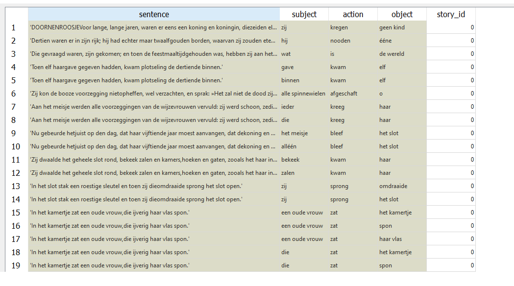
The subject-verb-object combinations for each story_id look like:
Step 4: Select Rows with a specific character
Task: Use the Select Rows widget to filter for rows where the subject is the narrator (e.g.,”ik” or “hij”).
Outcome: After filtering, only the character’s actions (verbs) will remain which will be used to classify according to the Halliday’s dimensions.
Widget: Select Rows → Data Table (3)

Step 5: Merge the Custom Word List with Story Elements
Task: Merge the Halliday categorization with the subject-verb list extracted from the fairytales using the Merge Data widget.
Outcome: You will have a merged dataset containing the subject, verb, and their corresponding Halliday categories.
Take care to ensure the merge is done correctly. In this case, the verbs related to the selected narrator will determine the merge, that is: the data from the Halliday categories are added to the subject-verb connections. The merged dataset is equal in size to the subject-verb connections dataset.
Step 6: Remove Irrelevant Columns and Inspect Data
Task: Use the Select Columns widget to remove any unnecessary columns for clarity and further analysis.
Outcome: A clean dataset with only relevant columns (e.g., subject, verb, Halliday category).
Widget: Select Columns → Data Table (7)
Step 7: Calculate Frequency of Categories
Task: Group the data by the Halliday categories using the Group By widget to calculate the frequency of each category (i.e., by counting how often a category appears in the data).
Outcome: A summary of category frequencies based on the actions of the selected narrator.
Widget: Group By → Data Table (6)
Hint: Ensure the grouping is by a Halliday category and that the frequency variable is aggregated using sum or count.
Step 8: Prepare Data for Plotting
Task: Use the *Edit Domain widget to adjust the variable type of the Halliday category for better plotting.
Outcome: The categories are formatted for optimal display in the radar plot.
Step 9: Create a Radar Plot
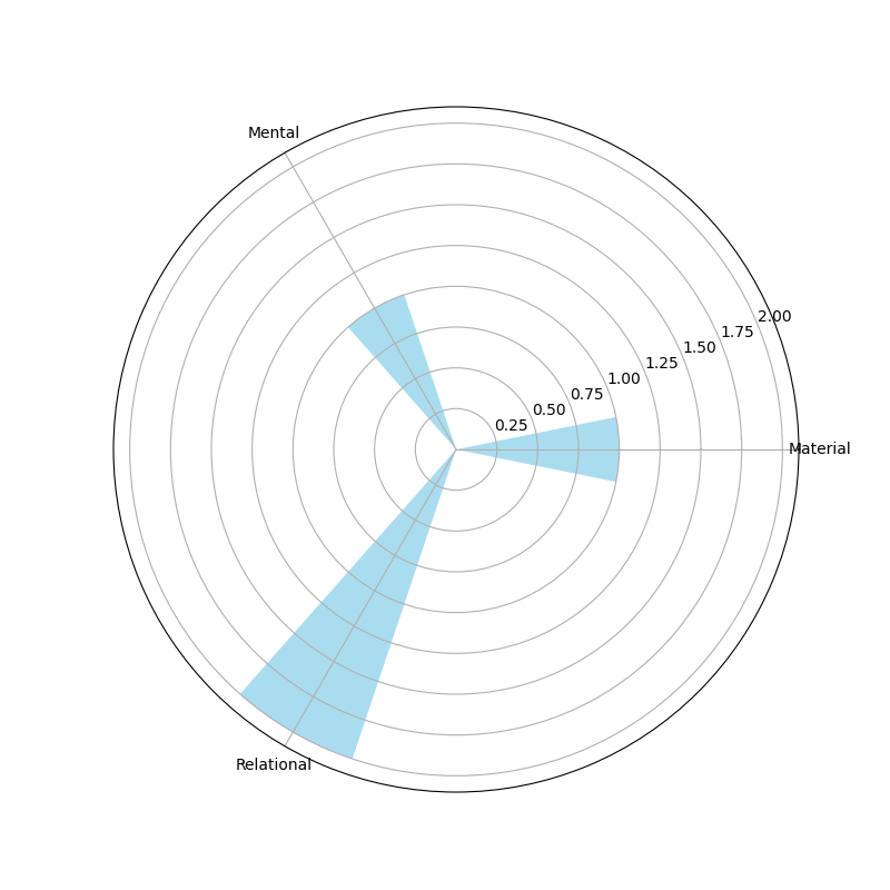
Task: Use the Python Script widget to generate a radar plot visualizing the distribution of verb categories for the selected narrator.
Outcome: A radar plot showing the distribution of verb categories used by the narrator will be generated.
Use the script below to generate the radar plot in the Python Script widget:
import matplotlib.pyplot as plt
import numpy as np
import pandas as pd

out_data = in_data
out_learner = None
out_classifier = None
out_object = None

if in_data is not None:
    try:
        # Extract 'category' and 'freq-sum' columns from the input data
        categories = in_data.get_column(in_data.domain["process"])
        freq_sum = in_data.get_column(in_data.domain["process - Count"])

        # Combine categories with same label
        df = pd.DataFrame({'categories': categories, 'freq_sum': freq_sum})
        df_grouped = df.groupby(['categories']).sum()
        categories = list(df_grouped.index)
        freq_sum = df_grouped['freq_sum']

        # Convert categories to string
        categories = [str(cat) for cat in categories]

        # Number of categories
        N = len(categories)

        # Compute the angles for the polar bars
        angles = np.linspace(0, 2 * np.pi, N, endpoint=False)

        # Initialize polar bar plot
        fig = plt.figure(figsize=(8,8))
        ax = fig.add_subplot(111, polar=True)

        # Plot bars on the polar plot
        bars = ax.bar(angles, freq_sum, width=0.4, color='skyblue', alpha=0.7)

        # Set the category names as the x-ticks
        ax.set_xticks(angles)
        ax.set_xticklabels(categories)

        # Optional: Customize y-axis labels or grid
        ax.yaxis.grid(True)

        # Display the polar bar plot
        plt.show()

    except KeyError as e:
        print(f"Error: Column '{e}' not found in the data. Check the column names.")
This produces something like:
Conclusion
By following these steps, you will be able to create a radar plot based on Halliday’s word categorization, showing how a specific person in a story uses different verb types across a story. This analysis enables a deeper understanding of the person’s linguistic choices, visualized clearly in the radar plot. Finally, this allows to compare different characters in the story based on their verb usage (cf. Andrade & Andersen, 2020).
References
Andrade, S.B. and Andersen, D. (2020). Digital story grammar: a quantitative methodology for narrative analysis. International Journal of Social Research Methodology, 23(4), 405-421.
Halliday, M. A. K. (2004). An Introduction to Functional Grammar. Routledge.